When Breaking Is the Point: How Glitches Became a Design Language
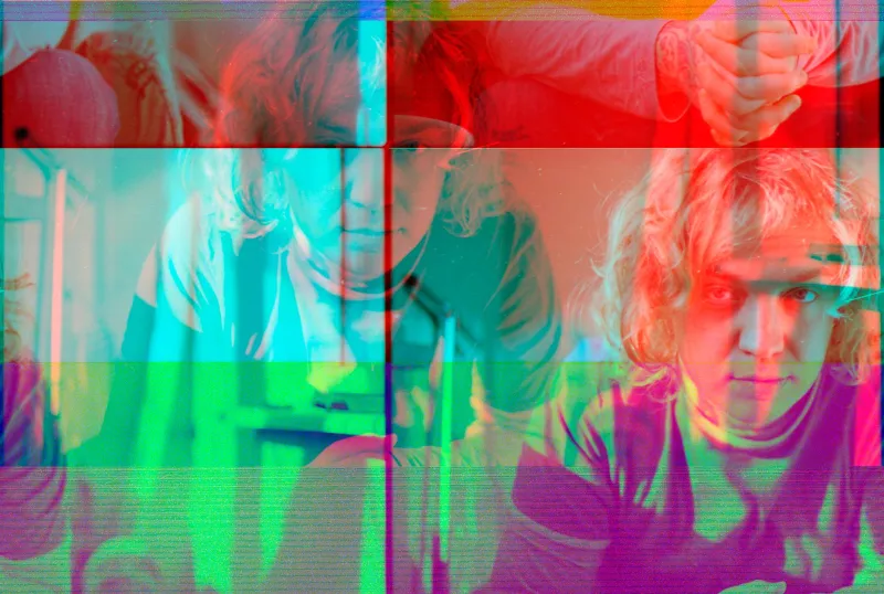
There's a moment in a lot of indie games where the screen tears, the texture pops wrong, or a character model folds into itself like a paper crane caught in a blender. A few years ago, that was a bug report. Today, it might be the most intentional frame in the whole experience.
We've crossed some invisible line where the aesthetics of failure have become the aesthetics of trust. And once you notice it, you can't stop seeing it everywhere — in album art, in motion graphics, in the visual identity of brands that want to feel like they're not trying too hard. The glitch isn't hiding anymore. It's front and center, doing real communicative work.
What a Glitch Actually Says
When something breaks in a digital environment, it reveals the machine underneath. The clean surface cracks and you see the code, the compression, the pixels fighting each other for space. For most of the internet's early history, that was shameful — evidence that someone hadn't done their job right.
But something shifted. Audiences started associating that seamless, frictionless perfection with corporate polish. With brands that had spent a lot of money making sure you never noticed the seams. And over time, that perfection started to feel like a lie. Or at least a performance.
The glitch, by contrast, shows the work. It says: this was made by someone, on hardware, in real time, under pressure. There's a body behind this. That kind of signal — raw, unsmoothed, slightly unstable — reads as honest in a media environment where so much has been optimized into abstraction.
Lo-Fi Was the Opening Act
The lo-fi aesthetic that took over YouTube study playlists and Spotify chill channels wasn't really about audio quality. It was about warmth. The vinyl crackle, the tape hiss, the slightly warbly piano — those imperfections said this was recorded somewhere real, by someone who cared, at a specific moment in time.
Visual design picked that up and ran with it. Scan lines from old CRT monitors started appearing in brand identities that had never been near a CRT. VHS-style color bleeding showed up in short films shot on modern mirrorless cameras. The distortion wasn't accidental — it was imported, carefully, from an older visual vocabulary that audiences associated with intimacy and authenticity.
Lo-fi taught designers that audiences weren't actually looking for perfect. They were looking for present.
Indie Games Made It a Craft
If lo-fi opened the door, indie games kicked it off the hinges. Developers working with small teams and tight budgets started leaning into their technical limitations rather than apologizing for them. Pixel art, which had been considered a step down from 3D rendering, became a deliberate aesthetic choice that signaled handmade care.
Then things got more specific. Games like Undertale, Hypnospace Outlaw, and Doki Doki Literature Club used interface glitches as narrative devices — the game appearing to break as a way of telling you something true about the story, or about the relationship between the player and the screen. The corruption wasn't a bug. It was a plot point. It was the most emotionally resonant moment in the whole experience.
That's a significant leap. It means the glitch has moved from being a texture — something that creates mood — to being a full-on storytelling tool. It can carry meaning. It can surprise you. It can make you feel something that a clean, well-rendered cutscene couldn't touch.
Film and Video Caught On
On the screen side, this aesthetic has been making its way into art house cinema and music videos for a while, but it's started bleeding into more mainstream visual work too. Directors will drop in digital noise, let the codec artifact on purpose, or frame a shot like the camera is struggling to process what it's seeing.
This isn't new — found footage horror was doing something adjacent to this for decades, using the language of bad video to create dread. But the current iteration is less about fear and more about intimacy. A slightly corrupted frame in a music video can feel like a memory. Like something almost lost. The degradation of the image becomes part of its emotional content.
There's also something happening in the documentary space, where filmmakers are deliberately mixing archival-looking footage with clean modern video in ways that let the texture of the older material bleed into the new. The roughness doesn't undermine the story — it deepens it.
Brands Got the Memo, for Better or Worse
Predictably, brands noticed. And here's where it gets complicated. When a small creative studio uses a glitchy visual identity, it feels like an honest expression of how they work — fast, experimental, a little chaotic, deeply human. When a Fortune 500 company runs a campaign with deliberately corrupted typography and VHS artifacts, it can feel like the opposite: a very expensive simulation of not caring about money.
The glitch aesthetic, like every honest signal, has a shelf life in the hands of people who are using it strategically. Audiences are pretty good at sensing when imperfection has been A/B tested. There's a difference between a designer who chose lo-fi because it matched their actual process and a brand team that chose lo-fi because a trend deck told them Gen Z responds to it.
The authentic version tends to be specific. The corrupted detail is somewhere particular, not sprayed over everything. The imperfection has a logic to it, even if that logic is hard to articulate. The fake version usually goes too hard — every element distressed, every edge roughed up, until the whole thing looks like a haunted house designed by a committee.
Why It Still Works When It Works
The reason the glitch keeps landing, when it's handled right, is that it operates on a frequency most design can't reach. It triggers something close to vulnerability — the sense that you're seeing something that wasn't fully controlled, that slipped through before it could be perfected.
In a media environment that is largely defined by curation, optimization, and the careful management of perception, that feeling of slippage is genuinely rare. It feels like contact. Like the person who made the thing let you get close enough to see the edges.
That's not a small thing. That's actually what most audiences are hungry for — evidence that something was made, not manufactured. The glitch, at its best, is that evidence. Messy, flickering, a little unstable, and completely convincing.