Step, Hold, Release: How the Smartest Brands Learned to Move With You
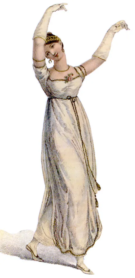
Photo: Unknown 1809 artist, Public domain, via Wikimedia Commons
There's a moment in a really good dance performance where you stop watching the dancer and start feeling the movement. Your shoulders drop. Your breath syncs up. You're not analyzing technique anymore — you're just inside the thing. The best brand experiences work exactly the same way, and the designers who understand that are building something most companies are still struggling to name.
Call it rhythm. Call it pacing. Call it choreography. Whatever the label, it's the difference between a website that processes you and one that actually moves you.
The Funnel Was Never About Feeling
For a long time, the dominant metaphor in brand design was the funnel. Awareness at the top, conversion at the bottom, and a series of nudges in between to keep you sliding downward. It's a useful model if you're thinking about volume. It's a terrible model if you're thinking about experience.
Funnels have physics. Things fall through them. There's no room for a pause, a breath, a moment of genuine surprise. You're either moving toward the sale or you're leaking out the side. The whole framework treats attention like water — something to be captured and directed, not something to be earned and respected.
The brands that are doing genuinely interesting design work right now have quietly abandoned that metaphor. They're not building funnels. They're building sequences.
What Apple Actually Figured Out
Spend ten minutes on Apple's product pages and you'll notice something that's easy to feel and hard to articulate. The scroll isn't just navigation — it's timing. Text appears at the exact moment you're ready to receive it. Images expand and contract like a breath. The whole thing has a pulse.
None of that happens by accident. Apple's design team treats each page like a performance with a tempo. There are fast moments — the quick cut to a spec, the sudden burst of color — and slow ones, where a single product shot hangs in space long enough for you to actually look at it. The pacing tells you how to feel before the copy tells you what to think.
That's choreography. Not in a metaphorical, hand-wavy sense. Literally: someone decided when to move fast, when to hold still, and when to let go. And the result is a user journey that feels less like being sold to and more like being invited somewhere.
Nike Runs on Rhythm
Nike's been doing something similar for years, but their version has more edge to it — more syncopation. Their digital campaigns don't just use movement as decoration. Movement is the message. The quick cuts, the overlapping audio, the way copy slams into frame and then vanishes — it all mirrors the physical experience of actually being in motion.
When you land on a Nike campaign page, the design isn't asking you to read. It's asking you to keep up. That's a deliberate choice. The brand has always been about the feeling of exertion, of pushing past resistance. Their design language encodes that feeling before you've even processed a single word.
What's interesting is how that rhythm shifts depending on what they're selling. Running gear hits differently than basketball. Lifestyle drops have a slower, more deliberate cadence than performance product launches. The tempo is part of the brand voice, and it gets adjusted the way a DJ adjusts a mix — based on who's in the room and what they need to feel.
The Emerging Brands Getting This Right
You don't need Apple's budget to build with rhythm. Some of the most interesting movement-forward design work right now is coming from smaller digital-first brands that have nothing to fall back on except the quality of the experience they create.
Take any number of independent creative studios and direct-to-consumer brands that have launched in the last few years with a heavy emphasis on scroll-driven animation, variable type, and what designers are starting to call "earned reveal" — the practice of withholding information until the user has done just enough work to feel like they discovered it rather than received it. It's a technique borrowed straight from performance. In theater, you don't show the audience everything at once. You build toward moments. You make them wait.
That waiting — that deliberate pause before the payoff — is one of the most underused tools in digital design. Most brands are terrified of empty space. They fill every frame, every second, every scroll with something. But silence in music isn't the absence of music. It's part of the composition. The brands that understand that are building experiences with actual texture.
Pacing as Brand Identity
Here's where it gets genuinely interesting from a design philosophy standpoint: rhythm isn't just a UX technique. It's a form of identity.
The tempo at which a brand moves tells you something about who they think you are. A fast, fragmented experience says: we assume you're distracted, we're competing for your attention, we'll grab you however we can. A slower, more deliberate experience says: we think you're worth the time, and we're worth yours.
That's a values statement embedded in motion, not copy. And it lands differently than any tagline could.
This is why the choreography metaphor is more than just a creative way to frame design thinking. Dance, at its core, is a relationship between performer and audience. The dancer is always reading the room, adjusting, offering something and seeing if it's received. The best brand experiences do the same thing — they're not broadcasting at you, they're in dialogue with you. The motion creates a kind of call and response.
What Screen Design Can Learn From the Stage
Film and television have always understood pacing as a fundamental storytelling tool. Editors talk about rhythm the way musicians do. But web and app design has historically been more obsessed with clarity and efficiency than with feel. Get the user where they're going. Remove friction. Optimize the path.
That logic makes sense for utility apps. It makes less sense for brands trying to build emotional connection in a landscape where every competitor is offering roughly the same product at roughly the same price. When differentiation lives in the feeling, the design has to be able to produce a feeling — not just communicate one.
The screen is a stage. The scroll is a timeline. The user is both audience and performer. Designers who internalize those facts are building things that are harder to describe but impossible to forget.
The Move Worth Making
None of this requires throwing out usability principles or making things deliberately confusing. The best choreography looks effortless precisely because the structure underneath it is so solid. A great dancer doesn't stumble around looking for the beat — they've internalized it so completely that the movement looks free.
That's the standard worth chasing. Not a design that shows off its own rhythm, but one where the rhythm is so well-calibrated that users don't notice the design at all. They just notice that they feel something.
And in a world drowning in content, a brand that can make you feel something without you quite knowing why? That's not just good design. That's the whole game.